Sunday, June 7, 2009

[Proposal] Mozilla Design Challenge Summer 2009 - Reinventing Tabs in Browser

Introduction

For their second Design Challenge, Mozilla asks the question: "Reinventing Tabs in the Browser - How can we create, navigate and manage multiple web sites within the same browser instance?"

The use of tabs has been helping us navigate the web by eliminating the need for window management. But due to the problems of visibility and disorganization, the usefulness and usability of tab bar deteriorate quickly as the number of tabs increases. Some people may wonder why we need to open so many tabs in the first place. In order to answer this question and to better understand how people use tabs, I had decided to do some research before I try to design my concept. Below is a list of common tab usage scenarios that I have come up with by researching online and summarizing my own experience.

  • Using tabs concurrently to achieve a specific goal - In this case, the tabs are related to the same subject matter. And the users might need to switch tabs quickly, especially when they are comparing the contents of multiple tabs. (As a side note, I designed a feature called Grid View for my last Design Challenge concept that allows the users to look at multiple tabs simultaneously. You could take a look at it here.)

  • Multitasking - For better or worse, we often use tabs to view web pages that are unrelated to each other. Our focus is constantly changing. Sometimes, we might manually change the order of tabs to prioritize our activities.

  • Using tabs as temporary bookmarks and sticky notes - Sometimes the users might find it too troublesome to bookmark multiple pages that are only used for an ongoing activity. So they might leave the pages opened as tabs and use them for more than one session (by using the save tabs option.) And sometimes the users might just want to keep pages opened as reminders. These pages will probably be closed within the current session.

  • Opening new links in tabs while still reading the current page – This is a technique used for supporting the above scenarios. By opening links in new tabs, the users could access multiple pages without disrupting their current workflow. It could also save the users' time by having the pages loaded in the background. Even though this is a very effective way of using tabs, I suspect that a lot of users are not aware of this technique because they don't know the shortcut key for opening link in new tab (middle-clicking and Ctrl-clicking.) So improving the visibility of opening link in new tab might be a problem that needs to be solved before revamping the tab system.


It is clear that in all of the above scenarios the users could benefit from having more tabs opened. And organization is the key to help users manage a large number of tabs. So for my concept, I focus on how to group tabs into smaller chunks so that the users could view and use tabs more easily.


Concept


Video Demonstration:
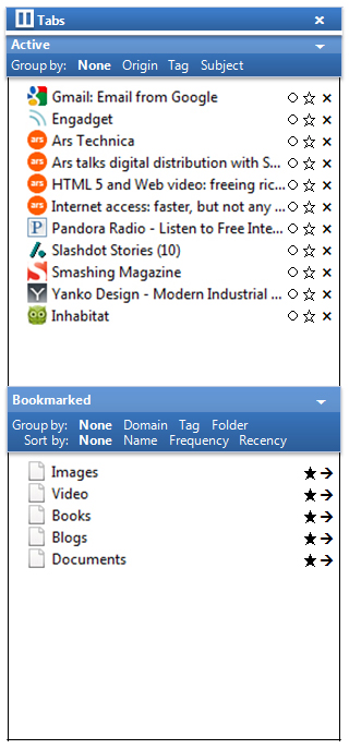


Sidebar

In terms of UI element, a sidebar is the main component of my concept. It is used for supplementing the tab bar, i.e., the users have the choice of using either the conventional tab bar or the sidebar. The reason behind this hybrid system is that a sidebar takes up a significant amount of space. Sometimes we want to trade functionality for simplicity. Having the sidebar omnipresent would be overkill when there are only a few tabs, which is a common scenario.

Although a list view of tabs scales well, the usefulness of the sidebar depends on the descriptiveness of the page title. In order to help users distinguish pages that don't have proper title, the sidebar would show a full-sized preview of the page when the cursor is hovering over the tab.


Active Pages & Bookmarked Pages

The sidebar consists of two sections: the active pages and the bookmarked pages. Very often, we keep tabs opened all the times not because we need to monitor their updates but because we need to use them frequently. So combining bookmarks and tabs into a single sidebar simplifies the process of page access and makes better use of screen real estate.


Hovering Buttons, Quick Tag Mode, Float

In order to simplify the interface, the control buttons would only appear when the cursor is hovering over the sidebar. For the bookmarked pages section, there are two buttons: tag, and open in new tab. For the active pages section, there are three buttons: float, tag, and close tab. Opening in new tab and closing tab are self-explanatory. As for the tag action, it is very similar to the bookmark action in Firefox. When the users click on the tag icon, the sidebar will enter the quick tag mode and a tag input panel would appear next to the sidebar. This interface allows the users to bookmark and apply new tags to multiple pages simultaneously without using a dialogue box. Lastly, the float action allows the users to prioritize tabs by keeping them on top of the list. This float status will work across sessions. And tabs that are floating will not be affected by grouping. So the users could always have quick access to important web pages/applications such as e-mails.


Grouping

Grouping is the key for better organization. Therefore, my concept has a few grouping options that can be used to reduce the complexity caused by a large number of tabs. For active pages, there are three grouping options: origin, tag, and subject. For bookmarked pages, there are also three grouping options, which are domain, tag, and folder. Grouping by domain, tag and folder are fairly self-explanatory. Grouping by origin allows the users to group pages that originate from the same page, which is a very common scenario.

Grouping by subject is what I want to elaborate on. We know that tags are very useful for categorizing pages, or all digital content for that matter. But the process of tagging requires too much human effort. So what I am proposing is a feature that allows the browser to automatically (and temporarily) tag and group active pages according to their subject matters. Given the difficulty of this task, it is obvious that this feature might not produce a very organized result. But sometimes we are willing to trade accuracy for convenience. Below is a rather technical description of the feature.


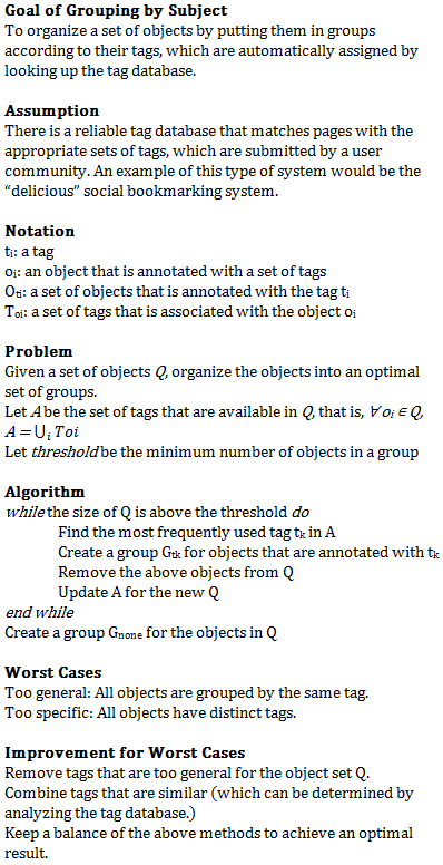
The above algorithm is very rough. And it makes a big assumption that there is a tag system that is capable of (1) annotating pages with tags in a timely and accurate manner and (2) keeping track of the relationship between tags (e.g. similarity). But I think automatic tagging is a very useful tool for easing information overloading, which is becoming a bigger problem for web users. And it is definitely something worth spending time thinking about.


Conclusion

To conclude, I'll try to explain how my concept assists the users in the four scenarios mentioned at the beginning.

  • Using tabs concurrently to achieve a specific goal - By presenting tabs in a vertical list, the sidebar allows the users to identify tabs at a quick glance. For tabs that don't have proper title, the full-sized preview of tab provides additional help.

  • Multitasking - All the grouping options allow the users to organize tabs accordingly. Since such grouping is presented by tree lists, the users could prioritize their activities by collapsing groups of tabs that need to be dealt with later (In fact, some of these functionalities are already implemented by add-ons such as Tree Style Tab.) The float action also allows the users to prioritize tabs by placing them at the top of the list. Lastly, grouping by subject is especially useful when there are a lot of tabs. Its auto-tagging functionality allows the users to quickly organize tabs in a cognitively useful manner.

  • Using tabs as temporary bookmarks and sticky notes - I think the "Save and Quit" option is already a very helpful tool for people who like to use tabs as temporary bookmarks. And for people who are discouraged to bookmark pages because of its complexity, the sidebar has a quick tag mode that allows the users to bookmark and apply new tags to multiple pages easily. For people who like to use tabs as reminders, the float action gives them the option to make a tab more prominent.

  • Opening new links in tabs while still reading the current page - The grouping by origin allows the user to easily organize tabs that are opened in this way. And such grouping would be retained even if the origin page is closed.


If you have any question about my concept, feel free to leave a comment.


This work is licensed under a Creative Commons Attribution 3.0 United States License

Wednesday, May 20, 2009

Mozilla Labs Design Challenge Spring 2009

I have recently participated in the Mozilla Labs Design Challenge. The goal was to design a web browser that answers the question "What would a browser look like if the Web was all there was? No windows, no unnecessary trappings. Just the Web." And I am happy to say that I have won the "Best in Class: Producible" honor award.

http://design-challenge.mozilla.com/spring09/

Below is my original submission:


An Information-Centric Web Browser


Overview:

For my final submission, I didn't develop an interactive prototype mainly because of insufficient time and my unfamiliarity with prototyping tools. I felt that if I forced myself to create a low-quality prototype, it would distract, rather than help, the judges from understanding my design.


My design consists of the following main features:

  • Address Bar - The main purpose of this feature is to allow the users to check the status of the current web page and to go to another destination. In my original mockup, I had included some implementation details on how the address bar works. But now I think its behaviors should be determined by the users' preferences and conceptual model. But one thing is certain: the address bar should not be overloaded with too many functions. Doing so will complicate the interaction and obscure the purpose of the address bar.

  • Status Bar / Notification Area - The functions of status bar are integrated into the address bar to achieve simplicity and consistency. Furthermore, the notification area is now a standalone feature that offers developers the ability to notify the users at their discretion. Depending on the robustness needed, the notification could be implemented by using web feed technologies or add-on.

  • Tabs - The use of tabs have improved the users' workflow when using a web browser. While a conventional tab bar might achieve a good balance between simplicity and functionality, its limited usefulness does not satisfy many users' needs. Thus, an additional tab manager is used to implement several different viewing options, including list, thumbnails, tree, grid, etc. In particular, the grid view allows the users to view multiple pages at the same time. The layout of the grid could be specified by using a simple table editor.

  • Contextual Menu - The purpose of the contextual menu is to facilitate sharing information across different online services. Since the intended scenario for this competition is set at a somewhat futuristic time, I assume that there will be a working implementation of semantics markup that will help the browser offer relevant commands. But to implement this feature at present time, the best we could do is to use a default menu for all selection. The user would then browse the categorized commands to perform their tasks. Even though natural language processing could help improve this process, I am not sure whether a web browser should handle this complicated problem. An ineffective use of natural language processing would offer little UX improvement while making the browser bloated.

  • Main Menu - The main menu consolidates all the different managers, including the bookmark manager, tab manager, etc. Even though it is called menu, it offers more than just a list of commands. It is a full-featured interface that supports all UI controls. The users could also dock the menu to the side and use it as a sidebar. The main goal of this feature is to improve visibility, consistency and coherency.


Short Summary:

This is a concept design for a web browser that helps the users (1) provide information, (2) access information, (3) connect information.


Mockups:


Description:

Thought Process

  • Before I designed the web browser, I asked myself: "What is Internet?" And my definition is that: The Internet is a platform where people use services and applications to share information through various media (e.g. text, image, video, etc.) As a result, a web browser should provide the necessary mechanisms to assist users in sharing information.

  • In order to make the browser as minimalistic as possible, I've used the bottom-up approach, i.e., I started with a blank UI and incrementally added features that I think will be necessary to a web browser.

  • The following are the features that I've come up with.


Address Bar

  • A browser should provide a way for the users to go to their destination web page.

  • Cybercrime will only become a bigger issue in the future. From a security perspective, it is crucial to know where we are when we are surfing on the internet. And unlike the real world, the Internet is a place in which everything could be fabricated. Therefore, it is necessary for the web browser to provide additional UI elements that help the users to determine the credibility of websites.

  • The address bar is good candidate for satisfying these two needs.

  • Implementation Details:


    • What I have in mind is basically a combination of what Firefox 3, Chrome, and Internet Explorer 8 have done with their address bars.

    • When the users click on the address bar, a drop-down menu will show up. It contains a list of websites with high "frecency" value and websites that users have specified (analogous to bookmarks bar.) The idea is that the users don't need to enter anything to go to their most frequently visited websites.

    • As the users start entering the address, a list of matching addresses from history and bookmarks will be shown. Also, the drop-down menu will show suggested addresses that match what the users are typing. This list of addresses will be categorized to eliminate any confusion.

    • When the users press enter, there are three outcomes.


      • If the users enter keywords only, the browser will send the query to the default search engine. Therefore, the address bar could also serve as a search bar.

      • If the address is a complete URL, the browser will take the users directly to that website.

      • If the users press a combination of keys (e.g. ctrl + enter, shift + enter, etc), the browser will always take the users to the most relevant web page regardless of the completeness of the address entered.


Status Bar / Notification Area

  • The two most important features of the status bar are the progress bar and preview of a link address. I think that these two features could be moved into the address bar. Other than saving space, this approach could also improve consistency by bringing the status and the address of the current page together. As for the preview of a link address, displaying it in the address bar reaffirms the purpose of the address bar, which is to take users to a specific web page. Therefore, the users only need to look at the address bar to determine the location and status of a web page.

  • Sometimes, the status bar is used by add-on developers to display notification. But I think that notification is important enough that it deserves its own space. Very often, we go to a web page to see if there is any update. This polling process is not efficient, which also explains the usefulness of web feed. Therefore, the ability to notify should extend to other online services.

  • Implementation Details:


    • The users have complete control over what notification they want to see.

    • The notifications are not intrusive. But they are noticeable enough that the users could always see what have been changed.

    • Clicking on the notification icon will bring up a small preview menu. An example might be a short list of unread e-mails.


Tabs

  • Tabbed window has been a great tool for multi-tasking in web browser. But I think that it would be more useful if the browser offers a way for the users to look at multiple web pages at the same time. This could be done either in the OS level or the browser level. From a consistency perspective, I think that windows management should be handled by the operation system. After all, we don't want to have a messy windows environment where the users have to use both Multiple Document Interface (MDI) and applications windows at the same time. But I also think that web pages are different from typical documents. The relations between different web pages could be used for organizing them. And the browser is more capable of determining that relation than the operation system. There is also the problem of demand. After all, not all users need to look at multiple web pages at the same time. So I think that in addition to the tab bar, the web browser should have a tab manager that could be used for satisfying different users' needs.

  • Implementation Details:


    • The tab bar is located below the address bar. Regardless of the number of opened tabs, the tab bar will always squeeze them together instead of hiding them by using horizontal scroll or vertical scroll. If the users need more space, they could resize the tab bar by dragging its edge. Although the tab bar will lose the essence of "tab" when it has multiple rows, I think this approach is quite user-friendly because it is visible and it gives users the ability to control the tab bar to meet their own needs.

    • The tab manager offers multiple viewing options. Add-on developers could always extend the tab manager by adding more options. Some default examples include the list view, the thumbnails view, the tree view, and the grid view. The grid view is used for viewing multiple pages at the same time. I've designed a new control element that is similar to a table editor. First, the users need to specify the number of rows and columns. But this symmetric layout is not flexible enough. In order to create a more complex layout, the users could click on a cell and add another grid inside it. And the maximum level of grid is two. Any more than that will be unnecessarily complicated. After setting up the grid, the users could arrange the web pages by dragging the tabs to different sections.


Contextual Menu

  • I think that no matter how advance and different web technology is in the future, the basic structure of a web page will be the same: it is a canvas that consists of various informational elements. And I think that the use of semantics will become much more prominent in the future. Therefore, the web browser should provide the necessary tools for the user to select and use these informational elements.

  • Implementation Details


    • A more streamlined and extensible right-click menu is used.

    • The top of the right-click menu is the title. It describes the semantics of the current selection. E.g. name, address, event, contact information, etc.

    • Below the title, there is a preview of the current selection. It improves usability by making the selection easier to evaluate.

    • Below the preview, there is a list of the most relevant and frequently used commands.

    • At the bottom of the right-click menu, there is a list of categories. This list is fixed. It shows all the available commands for the current selection.


Main Menu

  • No matter how simple a web browser is, it always uses a lot of individual UI elements to accommodate all the functionalities. Putting them in one place could greatly improve consistency and visibility.

  • Implementation Details:


    • A vertical menu located at the top-left corner will be used for consolidating all the default managers (e.g. downloads manager, bookmarks manager, history manager...)

    • In terms of appearance, the menu is organic and fluid. Upon hovering on a label, its corresponding interface will appear in a way that is similar to a typical menu. The difference is that the sub-menu is not just a list of commands. It is a full-featured interface. The size of the sub-menu would also change dynamically. So calling it "menu" might be a little misleading.

    • In terms of displaying behavior, the menu could either hover like a regular context menu or dock at the side like a sidebar.

    • In terms of functionality, the menu is extensible. Add-on developers have the option to implement their UI within this menu. For example, developers could implement an instant messenger or a text editor inside the menu. Because of the robustness and accessibility of the menu, the users could easily provide and access information with it.

    • Some default sub-menus:


      • Actions - By having a list of available commands, this sub-menu is similar to the contextual right-click menu. The difference is that the users could specify their own input (e.g. entering text, uploading image and video, etc).

      • History, Bookmarks - Search engines have been much more effective and efficient. As a result, the current approach of using history and bookmarks seems somewhat outdated. Since the focus of this design is not about history and bookmarks, I assume that a list of links will be displayed in these two sub-menus.

      • Miscellaneous - This is where the browser put other unrelated UI elements into. Some examples include printing, saving, etc.


    • Since this menu cannot satisfy all UI needs, add-on developers can use toolbar icons to access their own interfaces.


About me:

My name is Chaowen Tan. I am a junior at the University of Texas at Austin. When I first got into college, I was an electrical engineering student. But soon after I learned about user experience design and realized how interested I have been in making things easy and fun to use, I changed my major to computer science in order to pursue my passion for user experience design.


This work is licensed under a Creative Commons Attribution 3.0 United States License